Color Management is a Good Thing, or “why does Adobe Photoshop Album display my photos too dark, too light, or with a red tint?”
I initially posted this in the Adobe Photoshop Album User-to-User Forum as a reply to a thread. The user who started the thread was seeing a red tint in all of his photos in Photoshop Album, but nowhere else. A few questions and answers let me quickly figure out what his problem is: poor display calibration and/or a poor display profile. Looking around the forum, this is a common problem (though not everybody sees a red tint--sometimes photos appear too dark, too light, too green, etc).
As I wrote a reply to try and help solve the "red tint" problem and explain what was happening I realized this was becoming a feature-length response--something worth including on danandsherree.com. So, here it is, a brief overview of color management and how it affects images displayed within Photoshop Album--though all of the information is valid for anybody who wants a more accurate display.
What is Color Management?
The "traditional" way of working is also known as "device-dependant." When you edit your image on your monitor and print it yourself, you become comfortable with the workflow. You know that your monitor will be a little too bright and the reds a little too strong compared to when you print. You're used to how this all works and you're happy. But what if you have to buy a new printer or monitor? You start the process of judging it's capabilities again. And what if you want to send the image to a friend to print? You probably know from experience that his monitor displays the image too darkly and prints too blue--not what you want!
Enter color management and its goal: device-independant color. Can you imagine: within the capabilities of each device, you get the same results everywhere--on your monitor, your printer, your friend's monitor and printer, and even the printer at the photo lab. Suddenly you have the option of making edits to your photo for your friend to print, and you can know exactly how it will come out of his printer.
How does this miracle work? First, you need to be aware of the environment you're working in--is it color management-aware? In Photoshop, Photoshop Elements, and Photoshop Album (as well as many other applications) the answer is "yes," which makes everything easier: calibrate and build profiles, decide on working spaces and rendering intents, amongst other things. If the application is not color-management aware--such as Internet Explorer, Windows Picture and Fax Viewer, and just about everything else--you'll need to figure out what working space (probably sRGB) and rendering intent it uses, how it does or doesn't make use of your monitor and printer calibration and profile... it just becomes a lot of guesswork.
Display Calibration and Profiling
Before you start, let your monitor warm up--at least 1/2 hour. The first step to a color-managd workflow--or at least the most useful one--is to calibrate and profile your monitor. Adobe Gamma (included with Photoshop, Photoshop Elements, and Photoshop Album)--like every monitor calibration package--combines these two steps into one. Calibration is the process of setting your display to known values to maximize performance; profiling is the process of measuring and adjusting for all the little nuances of your monitor. Obviously, this means the calibration is much, much more important than the profiling; if the calibration is off the profile will be bad!
After Adobe Gamma (or whatever package you use) has completed run a few tests to see how good or bad of a job you've done and/or how capable your monitor and video card are or aren't. Good calibraton and profiling will results in a more neutral display and an environment in which you can better judge color and your photos. Poor calibration and profiling will result in color casts, images being too bright or dark, posterization (banding)... the list goes on and on. Returning to the Adobe User-to-User forum question, a bad profile is what causes the most problems.

First, the black level test. Download the image at the right to use on your system to check calibration. Open it in a non-color managed application--such as Internet Explorer--to view; alternatively open it in Photoshop and Soft Proof to Monitor RGB (View|Proof Setup|Monitor RGB). Ideally, display this image full-screen, hiding all toolbars, color palettes, menus--everything (in Internet Explorer press F11, in Photoshop press "F" "F" and tab); adjacent color can affect your eyes ability to see the patch correctly. As you can see in the too-bright example there are three patches in the center of the test: from top to bottom, "too-bright," "just-right" (the largest patch) and "too-dark." The "just-right" patch should be just barely visible; adjust brightness to make it appear correct. By "just barely" I mean you should be squinting with your nose right up against the monitor trying to decide if you can see the patch or not. If you can see the "too-dark" patch turn the brightness down; if you can't see "too-bright" turn the brightness up a bit. Almost everybody sets their monitor too dark.
Now that you've got your nose smushed against the monitor, go get a wet towel and clean it. In fact, you should have done that earlier. Yes, it makes a difference!
Setting the white point is a much more difficult task. Contrast should probably be close to maximum. Really, contrast can only be properly measured and set by hardware, but I've found an acceptable poor-man's solution to get you in the ballpark: pull out a sheet of your favorite photo paper to use (or a handful of sheets of copier paper, thick enough so ambient light doesn't shine through them). Draw a big white box in your favorite application. Do not place the paper over your screen to set the contrast level! Hold it out of the light that your monitor casts. Stretch your arm out to the right or left of your monitor with paper in hand; turn your head back and forth to compare. Adjust the contrast level until you think your monitor and the paper appear to be about the same brightness. Everybody sets their monitor brighter than it should be.
Do the black test again. Having just adjusted the contrast level you probably need to make some adjustments to the Brightness level. Then do the white test again. You might need to adjust Contrast again. Go back and forth until you've got them both correct.

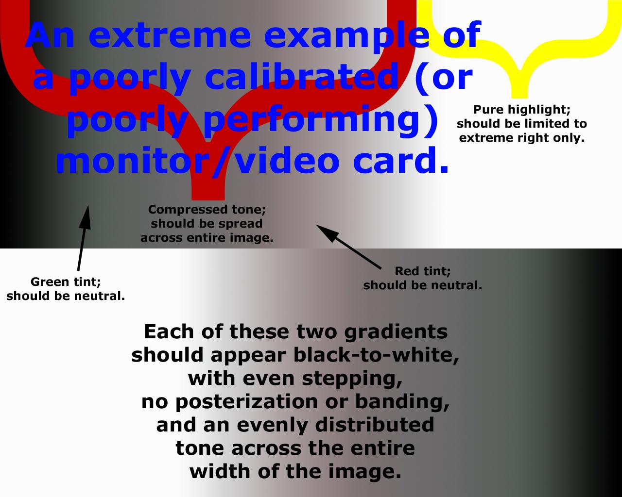
Next you'll want to check the gamma. You can use this test to check the calibration and profile for your display. Use the dual-gradient grayscale image at the right. The example shows lots of bad things: compressed tone, posterization (banding), tints, and exaggerated highlights. While I would be very surprised if anybody had a monitor that displayed as poorly as the example shows, I must warn you that this test will almost definitely disappoint you! To check the calibration open the test image in a non-color managed application--such as Internet Explorer--to view; alternatively open it in Photoshop and Soft Proof to Monitor RGB (View|Proof Setup|Monitor RGB). To use the gamma image to check the profile, open this image in a color-managed application--like Photoshop (don't Soft Proof it), Photoshop Elements or Photoshop Album and have a look at it. In both cases you're looking for the same thing: the gradients should display even tone from left to right. There should be no color casts and no posterization/banding (sudden jumps from one tone to the next). 50% tone should evenly meet in the center of the image. First check calibration--if it looks poor try adjusting your monitor's color temperature (6500 K is a good starting point and likely will produce good results); if the calibration looks good, great! Next use the image to judge your profile--if it looks poor, build a new profile; if it looks good, great, you're done! It's worth noting that colored items around your workstations can easily affect your ability to judge neutral gray.
As I said, you're likely to get disappointed by the results of the gamma test--for calibration or profiling results. It's a very tough test; the best monitors ever made show their shortcomings with it. Slight banding isn't something to worry too much about--I see some on my ViewSonic monitors. If calibration shows a slight color tint you'll definitely have a worse tint in your profile. Really, the way to remove the tint from the calibration process is by adjusting the R, G, and B guns on your monitor but doing so by eye will always yield worse results.
Other Considerations
These tests all work great if you have a CRT monitor. If you've got an LCD, though, you'll probably find you can only adjust brightness. Honestly, the only way to to properly calibrate an LCD successfully and easily is with a hardware-based solution, which can adjust the video LUT to make the other necessary corrections.
To do monitor calibration and profiling the right way, you really need to invest in a hardware solution such as the ColorVision Spyder or GretagMacbeth Eye-One Display. As I mentioned, only through hardware calibration can you correctly set the white point, and setting the black point will be easier, too. A hardware-based solution will also give you the option of specifying a different target gamma and help you adjust the RGB guns of your monitor to create a truly neutral display. The end result is a better calibration, which then means you can create a better profile to more accurately show your work on!
Lastly, a plug for one of my favorite books: Real World Color Management. Great information on color management, how color works, how we perceive color, and how it all fits together.
Share Your Thoughts (
Older Comments (2)
Dan & Sherree & Patrick currently uses Facebook for comments. Older comments are still here for readers, though. Read old comments »
This is an excellent article, however it did not explain this phenomenon: when I print for Photoshop Album 2 (full version) all the photos appear dark and the colors over-saturated;however when I print from Google's Picasa, the photos print significantly better. Photos I print straight from my camera to my printer are also perfect. Why is Photoshop Album giving prints that are so aweful, while Picasa (and another image program from Arcsoft) print so well? Thank you in advance.
This article was great it helped me a lot, thanks ! I always have the problem of seeing different colors in different softwares.
« Close old comments